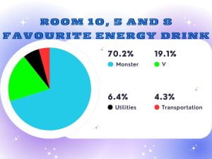
 We have been using different types of graphs to present data. We used a pie chart to show our favourite energy drinks.
The median is 6.
The range is 31.
The mean is 11.75.
There is no mode.

We have been using different types of graphs to present data. We used a pie chart to show our favourite energy drinks.
The median is 6.
The range is 31.
The mean is 11.75.
There is no mode.
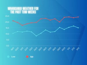
This week we are learning to choose the right type of graph for different data sets.
The mode for high is 19.6°C There is no mode for low.
The average for high is 21.42 The average for low is 12.62.
The median for high is 21.6°C The median for low is 12.
The range for high is 6.1 The range for low is 8.4.

This week we are learning to understanding how to use graphs to present collected data. Last week we learned about the mean, median, mode and range.

welcome to my blog
This week we have been learning about word problems in Math.
I am sharing with you about my maths work.
we have been exploring Addition & subtraction Multi-step word problems.
My favourite bit was when I finished the sheet.
One fact about me is that I’m in room 10.
as you can see this is a lot of writing.
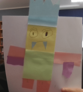 Hi guys! this is my monster Jeffery.
I made him in class yesterday, he is made out of different colour of sticky notes on a white sheet of A4 paper. we had to add numbers on his legs, I chose 1 and 2 only because I didn’t know what other numbers to do.
This is my Google docs that we had do and we had to write about a topic
I made a Google slid about a person that I think has Mana to me and I chose my mum.
 This is my Math work we had to do today its decimals, this is the best photo I could take.
 I made a poster on canva about whanganui community, there’s the big shiny earth on the river boardwalk, bastia water tower and a view of the city and river from durie hill tower.
The WALT was: Have an understanding of local geography, history, culture and community. Use visual and language features to promote our region.